Coded Layouts
This Web design example applies the CSS3 grid. See a grid with image links. Read the CSS3 rule-sets for horizontal and vertical layouts.
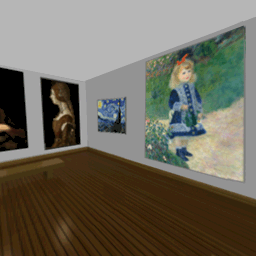
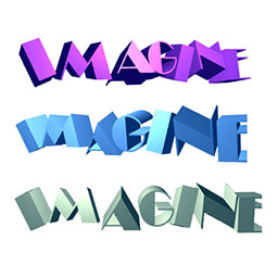
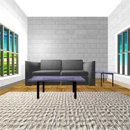

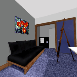
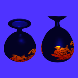
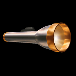

This Web design example applies the CSS3 grid. See a grid with image links. Read the CSS3 rule-sets for horizontal and vertical layouts.
This Web design image grid example includes image links inside a grid as well as the rule-sets that apply in both horizontal and vertical orientation.
Either rotate your phone or resize the browser window on a PC, to see cells in the grid rearrange in response to orientation changes.
Apparently grids overlap HTML elements that would, by default, display below the grid. I experimented with a number of different position properties and finally decided to simply add padding to the lower portion of the page.
Apply the padding short cut rule-set in
the following order; top, right, bottom and left.
That's clockwise from the top to the left.
For example padding:128% 0px 0px 0px;
applies 128% top padding only.
I added a position rule-set for both the default horizontal wide screen, a horizontal narrow screen and vertical narrow screen.
The default horizontal wide screen padding for the lower portion of the page follows.
padding:64% 0px 0px 0px;
The horizontal narrow screen padding for lower portion of the page follows.
padding:128% 0px 0px 0px;
The portrait narrow screen padding for lower portion of the page follows.
padding:256% 0px 0px 0px;
The following rule-sets are always loaded. Note the buttons section and grid layout properties.
Grids may cover anything that intrudes on its height.
Therefore be sure to add top padding to elements placed
below a grid. Horizontal orientation requires less vertical padding
when more cells layout horizontally.
Vertical orientation requires increased vertical padding when more cells
display vertically.
Padding for .pos2{... padding:64% 0px 0px 0px;}, below,
applies to the default horizontal orientation.
body{
margin:0px;
font-family:
system-ui; font-weight:100;
color:black;
background-color:white;
}

body,html,main{
height:100%;
}

main{
display:block;
clear:both;
float:none;
width:90%;
margin:0px 4% 0px 4%;
font-family: system-ui;
}

.pos2 {
float:none;
width:100%;
display:block;
clear:both;
padding:64% 0px 0px 0px;
}

/* BUTTONS */
div.toc{
width:100%;
display: inline-grid;
gap: 2% 2%;
grid-template-columns: 32% 32% 32%;
grid-template-rows: auto auto;
}

button.toc img.toc{
width:100%; padding:0px; margin:0px;
}
button.toc span.toc{
width:100%;
display:block;
font-weight:bold;
font-size:110%;
text-align:center;
padding-top:4%;
}
button.toc span.sml{
width:100%;
display:block;
font-weight:normal;
font-size:90%;
text-align:center;
padding-bottom:6%;
}

button.toc,button.toc:link,button.toc:visited{
text-align:center;
padding:0px;
color:dimgray;
background-color:whitesmoke;
background:whitesmoke;
border:2px solid darkgray;
}

button.toc:hover,button.toc:active
{
color:black;
background:gainsboro;
border:2px solid black;
}
This grid has an assigned height in portrait mode. However the width of the buttons at 60% cause the height to vary.
Grids may cover anything that intrudes on its height.
Therefore be sure to add top padding to elements placed
below a grid. Horizontal orientation requires less vertical padding
when more cells layout horizontally.
Vertical orientation requires increased top padding when more cells
display vertically.
Padding for .pos2{padding:128% 0px 0px 0px;}, below,
applies to vertical, portrait orientation.
.pos2 {
padding:128% 0px 0px 0px;}
}

/* Buttons */
div.toc{
height:1400px;
gap:1%;
display: inline-grid;
grid-template-columns: 60%;
grid-template-rows: auto auto auto auto auto auto;
margin-left:20%;
}

button.toc img.toc{
margin:0px;
padding:0px;
}
button.toc span.txt{
font-size:200%;
}
This page demonstrated application of CSS3 grid layout. You saw the grid layout and CSS3 rule-sets.
This Web design image grid example includes image links inside a grid as well as the rule-sets that apply in both horizontal and vertical orientation.


Contact me for Web graphics!
Copyright © 2022 Amy Butler. All Rights Reserved.