Web Design Tutorial
Page 1
Introduction
Introduction
This page introduces Web design from the basics to branding, layout, grid layouts, logos, color in design, navigation and consistency.
The next few pages apply these principles to create unique prototypes for different categories such as sites for games, financial institutions, art, shopping and blogs.
Basics
Website landing pages, such as the home page, should express fundamental concepts immediately, for each unique business. Communicate to the visitor what you do and how you can help them. Include links to related topics.
Brand
The brand, also called style guide
provides consistent
design throughout the site including a color theme, navigation system,
logo, fonts,
format for buttons, headers, footers, forms and images.
A clear style guide helps marketers with all facets of promotion. The brand applies to all material related to a business including business cards, brochures, signs, email and social media marketing.
Who Are You?
Clearly explain your Website's focus, values and mission statement.
Target Audience
Brand preparation focuses on a business's target audience. A company's clients often include a set of demographics, such as age, gender, financial status, location, language and culture. Most important, know your target audience's goals. Tell them how you can help them achieve their goals.
For example if your target audience wants to play games, design the style guide to engage visitors with interesting games. If investors are your target audience then the theme should communicate security, prosperity and confidence.
Layout
Layout represents the structure of your pages. Consider including at most three different page structures per sight. You might include landing pages, pages with more information, game pages, lists of items in a store, or a checkout page. Be sure to organize each page type consistently.
Landing Pages
When a user lands on your home page, on computers, in horizontal orientation, you might have a set of navigation links to the left and an image with some descriptive text under the image. On mobile devices, in vertical orientation, you might have a set of navigation links that roll out when the user taps an arrow icon, with images spanning the entire width of the page.
Grid Layout
Grid layouts with CSS3 provide great opportunities to structure each page in such a way that they scale up and down as needed based on device screen size and rotation. The following grid layout simply displays HTML named colors. Consider grid layouts for versatile pages that reorient based on the viewing device. See CSS and markup, below.
CSS and Markup
The following CSS rule-sets prepare a container for the grid,
with three columns. Individual grid-items, placed within
the grid-container include padding and borders.
.grid-container {
width:100%;
display: inline-grid;
grid-template-columns: auto auto auto;
background-color: ghostwhite;
padding: 1%;
}

.grid-item {
background-color: lightblue;
color:blue;
border: 1px solid blue;
padding: 4%;
font-size: medium;
text-align: center;
}

.grid-header{
color:white;
background-color:indigo;
border: 1px solid blue;
padding: 4%;
grid-column: 1 / span 3;
font-weight:bold;
font-size: medium;
text-align: center;
}
Markup
<div
class="grid-container">
<div

class="grid-header"
>
Web Named Colors
</div>

<div
class="grid-item"
style="background:greenyellow;">
greenyellow
</div>

<div
class="grid-item"
style="background:lavenderblush;">
lavenderblush
</div>

<div
class="grid-item"
style="background:honeydew;">
honeydew
</div>

<div
class="grid-item"
style="background:ivory;">
ivory
</div>

<div
class="grid-item"
style="background:lightgrey;">
lightgrey
</div>

<div
class="grid-item"
style="background:linen;">
linen
</div>

<div
class="grid-item"
style="background:oldlace;">
oldlace
</div>

<div
class="grid-item"
style="background:mintcream;">
mintcream
</div>

<div
class="grid-item"
style="background:deepskybluee;">
deepskyblue
</div>

</div>
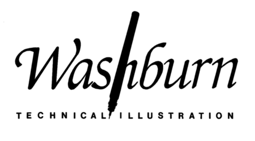
Logos
Logos express a business's name with a specially
designed font and color. Often the font
includes visual elements such as simplified images.
For example the inside of an O
might display the outline of an element.

The logo below, includes a technical pen
incorporated within the text for Washburn Technical Illustration
.
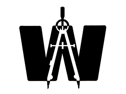
Symbols
Symbols are often confused with logos. Logos include characters, or text. Symbols express a business with shapes. Sometimes those shapes resemble characters, objects or geometry. Symbols remind clients of your business, with the most efficient use of space.
Optionally symbols display in either solid colors or just black and white. A symbol should provide clarity such that it's legible reduced down to one half inch square and simple black and white.
The simplicity of a symbol allows packaging printed in one color to convey your business brand quickly.
For example the A.W
symbol below, applies positive and negative
space with a simple black and white symbol.
The letter W
includes a compass with negative space.
The compass forms the letter A
.
Color in Design
Most designs include two or at the most three colors.
The color palette should apply across all full color marketing material. Colors communicate emotion without words. For example reds, oranges and yellows might express fire, excitement or danger. Blues and greens might express clean water, foliage or beautiful landscapes.
Color Wheel
The standard artist's color wheel below, has added hexadecimal characters for Web development.
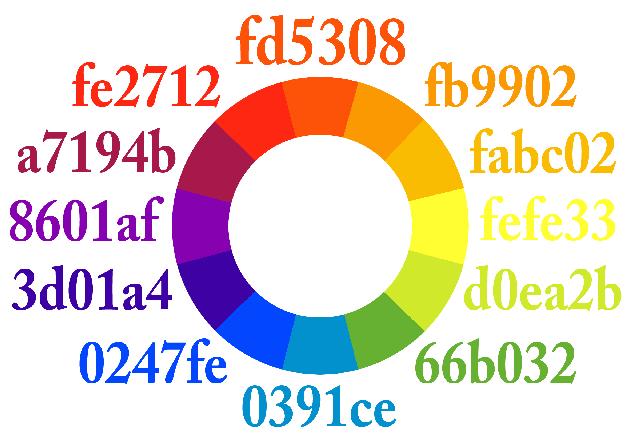
Analogues
Three colors adjacent to each other on the color wheel, called analogues
,
almost always work together and present a theme.
For example blue, aqua and green seem soothing.
Violet, violet-red and violet-blue might seem creative.
Yellow, orange and yellow-green seem like Spring.
However the same colors with a black background might evoke other feelings.

Complementary Color
Complementary colors appear opposite each other on the color wheel. For example blue and orange are complements. Yellow and violet are complements. Apply complements sparringly unless you want to jar the senses.
Value
Value represents the darkness or lightness in a hue, or color.
Light values together seem relaxing. Dark against light or
light against dark values, may seem cause your eyes to jump
.
More subtle Websites apply grays, or hues with
consistent values.
Designers can create very stunning Websites with complementary colors and opposite values. Optionally consider designing a site with primarily analogous colors and just a touch of complementary color, to grab attention.
The color-value combinations below demonstrate contrasting (complementary) colors with contrasting values.
Hue, Saturation and Lightness
We've discussed hue, or color, and lightness, or value. Saturation refers to the intensity of a color. The following graphic demonstrates hue, saturation and lightness.
Reading from left to right, the vertical strip to the left displays maximum saturation. The next vertical strip renders the same set of colors, however they're lighter. Their value is higher. The next vertical strip renders the same set of colors, however they're darkend. The color values are lower. The last vertical strip renders the same set of colors, however they're slightly less saturated.

Target Based Palettes
The set of colors you select for your palette should reflect your target audience. Investors might want subdued, gray, low saturated colors. Gamers might want bright colors with light to dark contrast and complementary colors.
Popular color schemes seem to change on a regular base. You might like Color Trends at W3Schools.
Navigation
Navigation allows visitors to easily find pages and information that businesses feel are most important.
Navigation should present a structured, organized and consistent method to view various pages on a site. Navigation ideally offers visitors a very easy path to find their objective.
Menus
For example menus include features that are important to the target audience and the business. Menus often include topics such as contact, about us, services, products and blogs. Menus usually appear horizontally toward the top of each page or vertically toward the left side of each page.
Menu items should appear in order of importance, to guide visitors quickly. However place the most important links toward the top and the bottom. Visitors usually quickly scan a menu from top to bottom and overlook links in the middle of the list.
Keep menu items to a minimum, perhaps seven links.
Too many links can cause confusion delusion
allowing the visitor to lose interest.
Graphical Response
Provide responsive input for viewers. Links should respond to the viewer's touch and click events. However don't respond with too many visual cues. This again can confuse or disorient visitors.
Footers
Most Websites include a set of links toward the bottom of each page for additional information.
Consistent & Unique
Consistency is key to Website design. Keep the menu and footer in locations common to most Websites. Maintain menu location and footer locations throughout each page of a site. Minimize the number of colors and page layouts to about three.
However feel free to provide a unique look to your site. Ideally it's familiar enough to navigate and unique enough to grab attention.
Summary
We introduced Web design from the basics to branding, layout, grid layouts, logos, color in design, navigation and consistency.
The next few pages apply these principles to create unique prototypes for different categories such as sites for games, art, financial institutions, shopping and blogs.
Modern Web Design